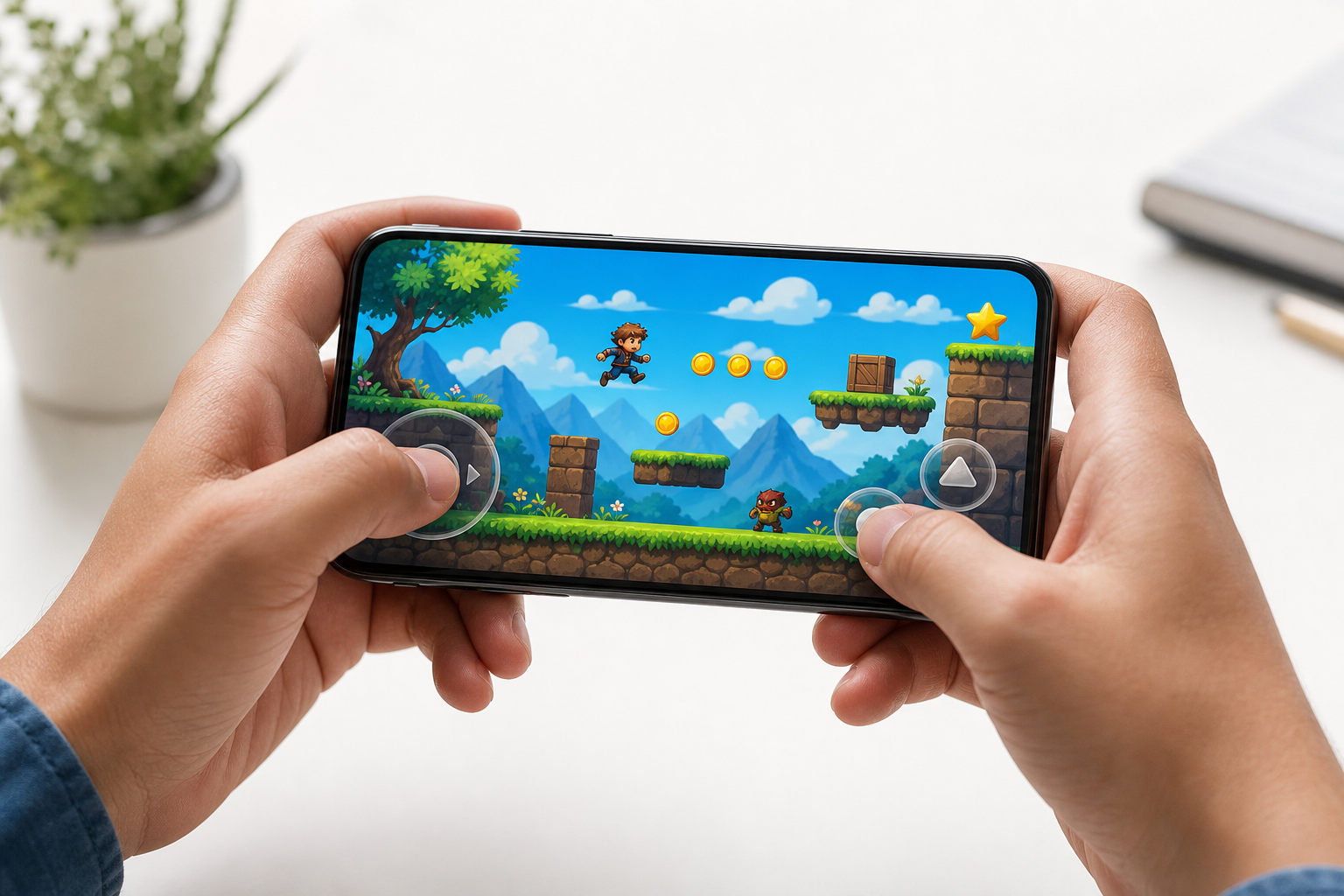
Browser games feel different on a phone because the device changes more than the screen. You are replacing a mouse and keyboard with fingers, playing on a smaller display, and often switching between portrait and landscape orientation. A game that feels precise and comfortable on a desktop may therefore feel crowded, slow, or difficult to control on mobile.
The short answer is that mobile browser gaming works best when the game’s controls match the screen and the way you hold the phone. Touch controls need room for your fingers, small targets need to be easy to see, and games with movement or aiming often benefit from landscape mode. If a game feels awkward, the problem may be the layout rather than your device or skill.
Why touch controls change the way a game feels
A mouse gives you a visible pointer and precise movement. A keyboard gives you separate keys for movement, actions, and shortcuts. Touch controls remove both. Your finger covers part of the screen, and every tap or swipe has to be interpreted without the physical feedback of a button.
This creates several common differences:
- Less precision: Tapping a small button or object is harder than clicking it with a mouse.
- Hidden information: Your finger can cover the target you are trying to select.
- Fewer simultaneous inputs: Some phones and browsers handle multiple touches differently, especially in fast games.
- Less tactile feedback: You cannot feel a keyboard key or mouse button activate beneath your finger.
- Accidental inputs: A swipe may scroll the page, open a browser gesture, or move an object unintentionally.
Good mobile controls compensate by using larger buttons, forgiving hit areas, simple gestures, and clear visual feedback. If a game expects tiny, rapid clicks or several keyboard keys at once, it may be less comfortable in a mobile browser.
Touch controls that usually work well on phones
Not every control method suits every game. The best option depends on whether the game asks you to tap, steer, aim, drag, or react quickly.
Tap controls
Tap-based controls are usually the easiest to understand. They work well for selecting objects, answering choices, opening menus, and triggering simple actions. Puzzle games and casual games often benefit from this format because the player can focus on the game rather than learning a complicated control scheme.
When tapping, aim for the center of a button or object rather than its edge. If the page appears zoomed in or the game interface is crowded, rotating the phone or using the browser’s full-screen option may create more usable space.
Swipes and drags
Swipes are useful for moving objects, changing direction, or navigating a larger play area. Dragging can feel natural in puzzles, but it becomes frustrating when the target is small or the page scrolls at the same time.
To make dragging more reliable, begin directly on the object, move slowly at first, and release only after the destination is clearly highlighted. If a game uses a virtual joystick, place your finger near its center and keep contact with the screen while moving.
On-screen buttons and virtual joysticks
Virtual buttons can replace keyboard keys, while a virtual joystick can handle movement. They are helpful in action and racing games, but they take up valuable screen space. Their position also matters: controls near the edge may be difficult to reach with one hand, while controls placed over important game elements can block the view.
If a game offers control settings, test sensitivity before starting a difficult level. A lower sensitivity can make aiming easier, while a higher sensitivity may help with quick turns. There is no universal best setting; the right choice depends on the size of the phone and how lightly you move your finger.
How screen size affects mobile browser games
A larger phone screen can make buttons and game objects easier to see, but screen size alone does not guarantee a better experience. The game’s layout, aspect ratio, and scaling determine how much useful space you actually have.
On a smaller screen, several problems become more noticeable:
- Text may be difficult to read without zooming.
- Buttons may appear close together, increasing accidental taps.
- Important objects may be hidden behind interface controls.
- Fast movement can be harder to follow.
- Virtual controls may cover a larger percentage of the play area.
Zooming can help with instructions or menus, but it is not always helpful during play. Zooming in may make one area easier to see while hiding another. If the game does not respond correctly after zooming, return to the default page scale and try full-screen mode instead.
Portrait or landscape: which orientation is better?
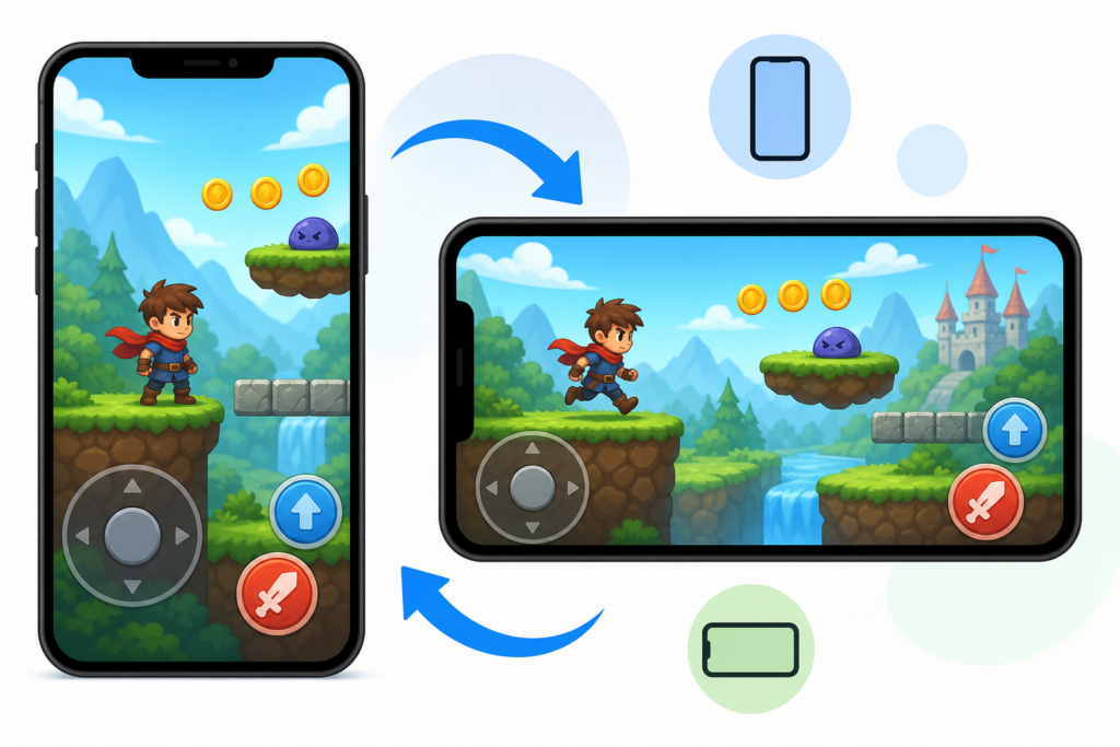
Orientation changes the shape of the available play area. Portrait mode gives you a tall, narrow screen and is often convenient for one-handed play, menus, vertical games, and short sessions. Landscape mode provides more width and usually gives your thumbs room to sit on opposite sides of the screen.
| Orientation | Often works well for | Possible drawback |
|---|---|---|
| Portrait | Simple tap games, menus, vertical play areas, one-handed sessions | Less room for wide maps, steering, and two-sided controls |
| Landscape | Racing, action, aiming, platform-style movement, wide scenes | Harder to hold with one hand and may leave unused space in some games |
If controls feel cramped in portrait mode, rotate the phone before changing other settings. Landscape orientation often separates the control area from the action and makes a wider field easier to read. If the game’s content becomes stretched, cropped, or rotated incorrectly, return to the original orientation and reload the page.
How to make browser games on mobile easier to play
- Use a stable connection. A weak connection can make a game appear unresponsive, although the real issue is loading or delayed input.
- Close unnecessary tabs. Other tabs and apps can compete for memory and make the browser feel sluggish.
- Clean the screen. Fingerprints, moisture, and dirt can make taps and swipes less reliable.
- Try full-screen mode. Removing some browser interface can give the game more room, when the site and browser support it.
- Rotate before playing. Test both orientations on the start screen rather than changing during an important moment.
- Keep the phone steady. A case, stand, or two-handed grip can improve accuracy during longer sessions.
- Check browser permissions and settings. If the game requires sound, motion, or another browser feature, blocked access may affect the experience.
- Reload after changing orientation or zoom. Some browser games resize correctly only after a refresh.
Do not repeatedly tap when the game seems slow to respond. That can create several inputs at once after the page catches up. Wait briefly, check the connection, and reload if the delay continues.
Which types of browser games suit mobile best?
Games with clear targets, simple actions, and limited text are generally easier to play on a phone. Tap-based puzzles, casual activities, and games that use broad movement areas can feel natural on touchscreens.
For a quick test, try a game where the main action is easy to understand. Fidget Toy Pop It Game is a natural example of a simple touch-oriented activity, while Fun Jigsaw Puzzle Game can suit players who prefer deliberate selection and visual organization.
Games involving steering or movement may need more adjustment. A racing game can be enjoyable in landscape mode if the controls are comfortably spaced. You can try Bike Racing Adventure and test whether its movement feels more manageable with two hands and the phone held horizontally.
Action and 3D games can place greater demands on visibility and response time. If you try Escape the Giant School 3D or Helicopter Rescue Games 3d, pay attention to whether the screen gives you enough room to see the scene while using the controls. The most comfortable setup may depend on your phone, browser, and grip.
Why the same game may feel different across phones
Two phones can produce noticeably different results even when they open the same browser game. Screen dimensions, touch sensitivity, browser scaling, performance, and operating-system gestures all affect how inputs are interpreted.
A phone with a narrow display may place controls closer together. A device with a larger display may show more of the game but require longer thumb movements. Some browsers also reserve space for address bars or gesture areas, reducing the usable play area. Performance differences can affect animation smoothness, which can make controls seem delayed even when your taps are registering.
External conditions matter too. Heat, low battery, a thick case, wet hands, and background apps can all make a session less comfortable. These issues do not necessarily mean the game is broken; they may simply indicate that the setup needs adjustment.
When touch controls are not the best option
Touch is convenient, but it is not ideal for every type of game. A game may feel better with a physical keyboard, mouse, or compatible controller if it requires precise aiming, many simultaneous keys, rapid repeated actions, or long sessions.
If your phone supports an external Bluetooth controller or keyboard, compatibility can vary by browser and game. Test the controls on a non-critical screen first. A device may connect successfully while the game still expects touch input.
For comparison, a slower strategy or puzzle experience may be easier to judge on either a phone or computer. The guide How to Compare Two Free Online Games Before You Start Playing can help you compare control demands, pace, and overall fit before committing to a longer session.
A quick mobile control checklist
Before deciding that a browser game does not work on your phone, check the following:
- Are you using the orientation that gives the controls more room?
- Can you see the target without your finger covering it?
- Are the browser zoom and page scale at a sensible setting?
- Would full-screen mode reduce distractions?
- Is the page responding slowly because of connection or background activity?
- Are you accidentally scrolling while swiping?
- Would two hands, a stand, or an external controller help?
If the answer to most of these questions is yes, the game may simply need a better setup. If the controls remain too small, the screen stays cropped, or inputs consistently fail after a reload, choosing a different game type or using a larger device may be the better solution.
Final takeaway
Browser games on mobile feel different mainly because touch input, screen size, and orientation change the relationship between you and the game. Tap-based activities often need little adjustment, while racing, action, and 3D games may benefit from landscape mode, two-handed play, full-screen viewing, and carefully tested sensitivity.
Start with the simplest fixes: rotate the phone, clear extra browser clutter, check the page scale, and give your fingers more room. Then choose games whose controls match the touchscreen instead of forcing a desktop-style setup onto a small display. With the right orientation and control layout, many browser games can feel comfortable and responsive on a phone.